Maple
Rebuilding Maple's Product Experience From the Inside Out
Maple is Canada's largest virtual care platform, connecting patients with real healthcare providers in minutes.
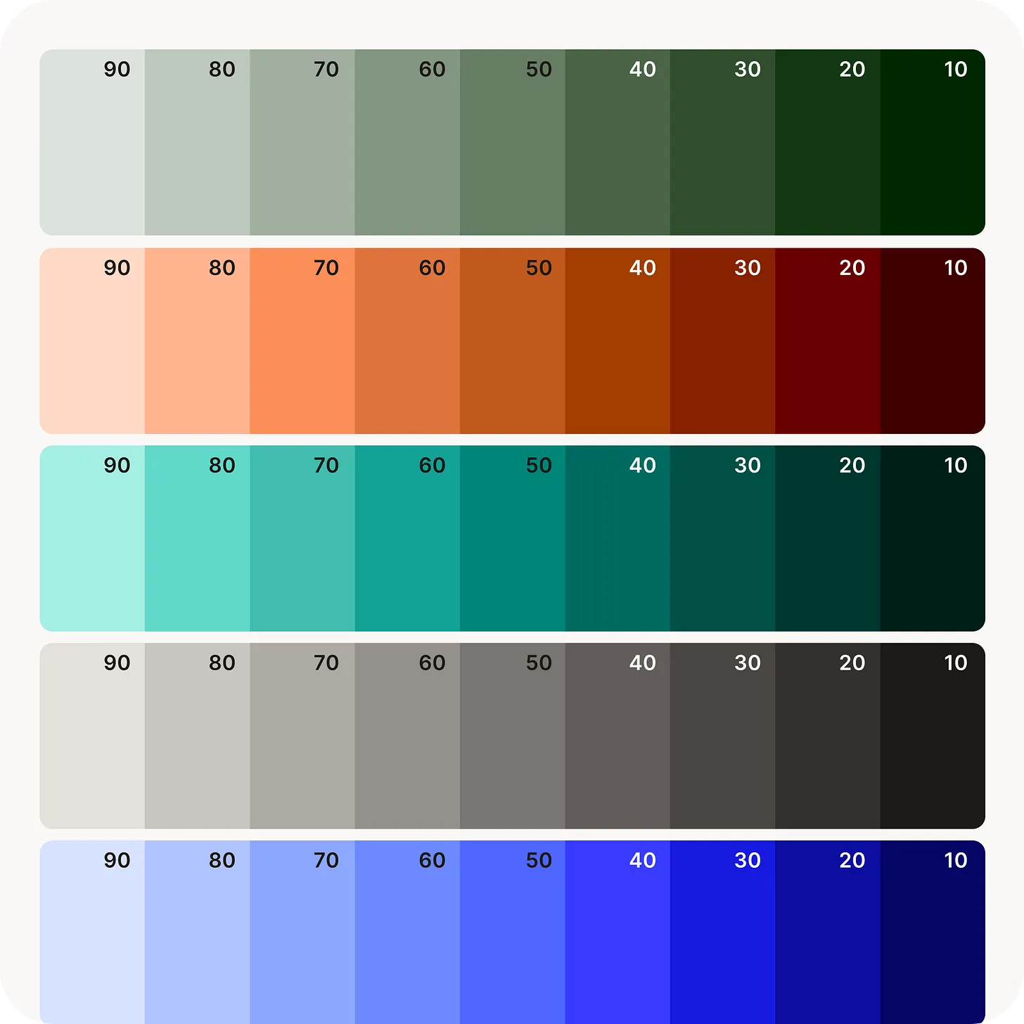
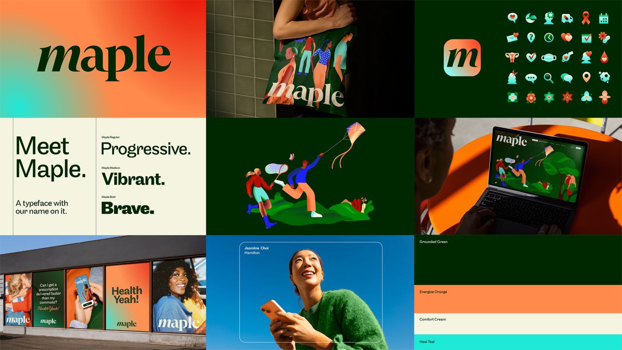
In 2025 and 2026, I led the product side of Polaris, Maple's full brand rebrand — from an honest audit of a decade-old design system, to building a new token architecture, typography, and component library from scratch, to personally redesigning 80+ screens across the patient and provider experience. I worked directly with two staff engineers to close the gap between what got specced in Figma and what actually shipped in code, and partnered closely with Brand and Marketing so real product moments shaped the brand as much as the brand shaped the product. The new experience launched publicly on May 7, 2026 across Maple's patient app, provider tools, and admin surfaces — a new colour and type system, a custom illustration set, 150+ redesigned icons, and a design system built to grow with the brand instead of chasing it.
A few teasers from the brand refresh